INTENTIONAL AESTHETIC. VISUAL VIBES. BRAND ALCHEMY.SydneyValk
BRAND GUIDELINES by Haus of Hazel
a womanhood reclamation movement. soft enough to hold grief. strong enough to change the world.
MAIN HEADING:
Atelier Femme
Modern Font TrioPARAGRAPH/BODY TEXT:
Albert Sans
FONTSMain Heading Font Italic
Aa Bb Cc Dd Ee Ff Gg Hh Ii Jj Kk Ll Mm Nn Oo Pp Qq Rr Ss Tt Uu Vv Ww Xx Yy Zz
Handwritten script font
Aa Bb Cc Dd Ee Ff Gg Hh Ii Jj Kk Ll Mm Nn Oo Pp Qq Rr Ss Tt Uu Vv Ww Xx Yy Zz
This typographic pairing positions Sydney as a practitioner who is both deeply feminine and highly credible. The combination balances softness with authority, creating a brand presence that feels professional, trustworthy, and emotionally resonant without becoming overly clinical or overly spiritual.
Atelier Femme introduces elegance, a sense of personal closeness, and femininity. Featuring an upright serif, refined italic, and handwritten script, it allows the brand to move fluidly between education, storytelling, and personal connection. The serif communicates maturity and expertise, while the italic and script variations soften the experience, bringing a sense of intimacy to the brand.
Contrasted with Albert Sans, which provides the structure that balances this femininity. Clean, modern, and highly legible, it ensures information is easy to absorb across websites, educational resources, guides, and long-form content. It reinforces Sydney's role as an educator and practitioner, helping communicate complex topics such as cycle health, fertility, conception, birth, loss, and feminine physiology with clarity and confidence.
Together, this typographic system positions Sydney's brand as:
Feminine without feeling overly delicate
Professional without feeling clinical
Luxurious without feeling exclusive
Warm without sacrificing authority
BUTTONS
sydney valkA SPACE FOR THE MOTHER, LOVER, CYCLE KEEPER, THE INTUITIVE DREAMER, WOMB KEEPER, GRIEF TENDER, TRUTH TELLER, WISDOM KEEPER, EARTH WOMAN, WILD WOMAN, WOMAN REMEMBERING.
Sydney's work guides women back into relationship with their womb, body, grief, sensuality, fertility, and feminine knowing.
Through deep witnessing, embodied education, womb mentorship, and transformational care, she supports women through some of the most profound initiations of their lives — from painful cycles and body disconnection to conception journeys, pregnancy loss, and feminine reclamation.
CLIENTS SHOULD FEEL ↘
Held
Witnessed
Deeply understood
Rooted in their bodies
Connected to their inner knowing
Trusting of their biology
Capable of meeting life's initiations
Certain they were never broken
Her chart creates a powerful combination of the pioneer, the teacher, and the movement-builder. Aries Rising gives her the courage to challenge outdated narratives around women's health, the feminine rites and birth. Mercury in Capricorn in the 10th House gives Sydney the authority to educate, lead, and become a respected voice in the field. Venus in Aquarius in the 11th House expands her work beyond individual healing into collective transformation, community, and cultural change.
Together, these placements create a brand world that feels like:
A homecoming wrapped inside a revolution.




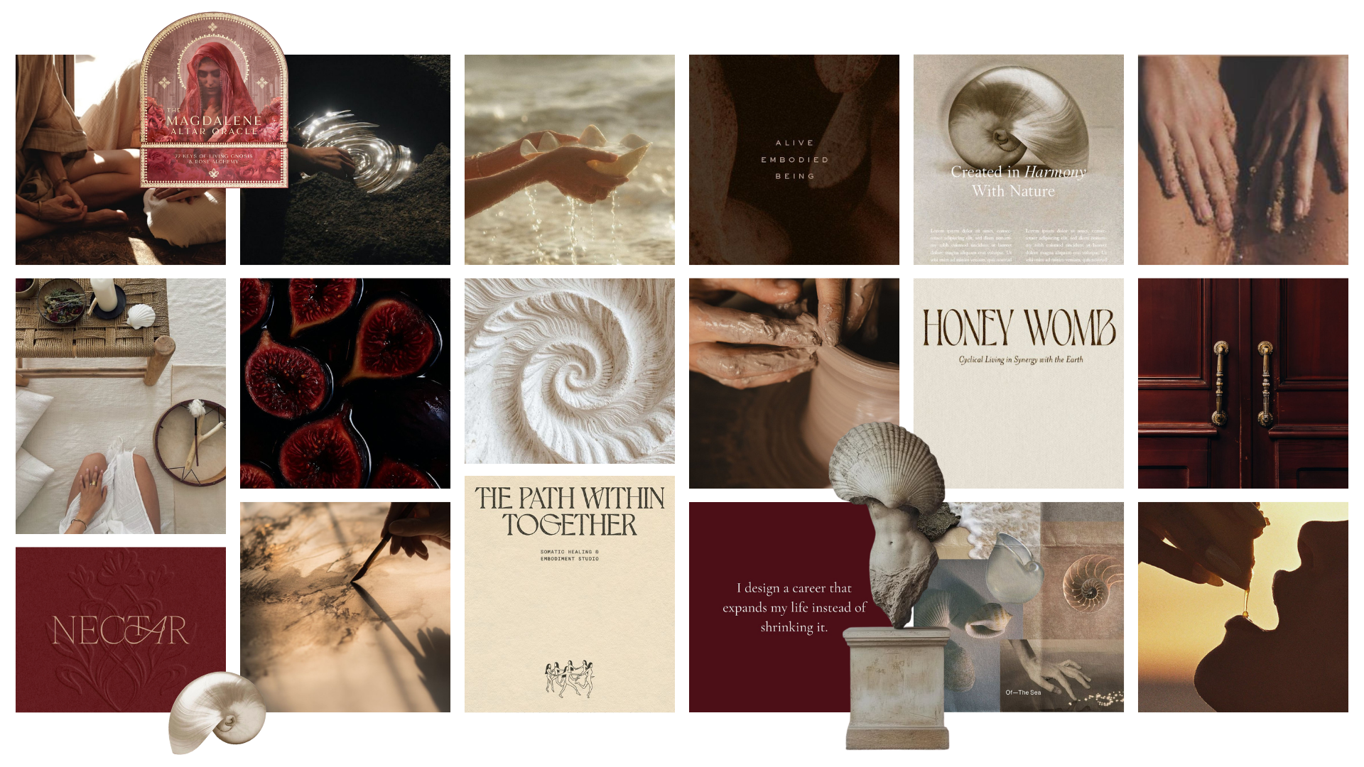
BRAND VISION & MOOD BOARD
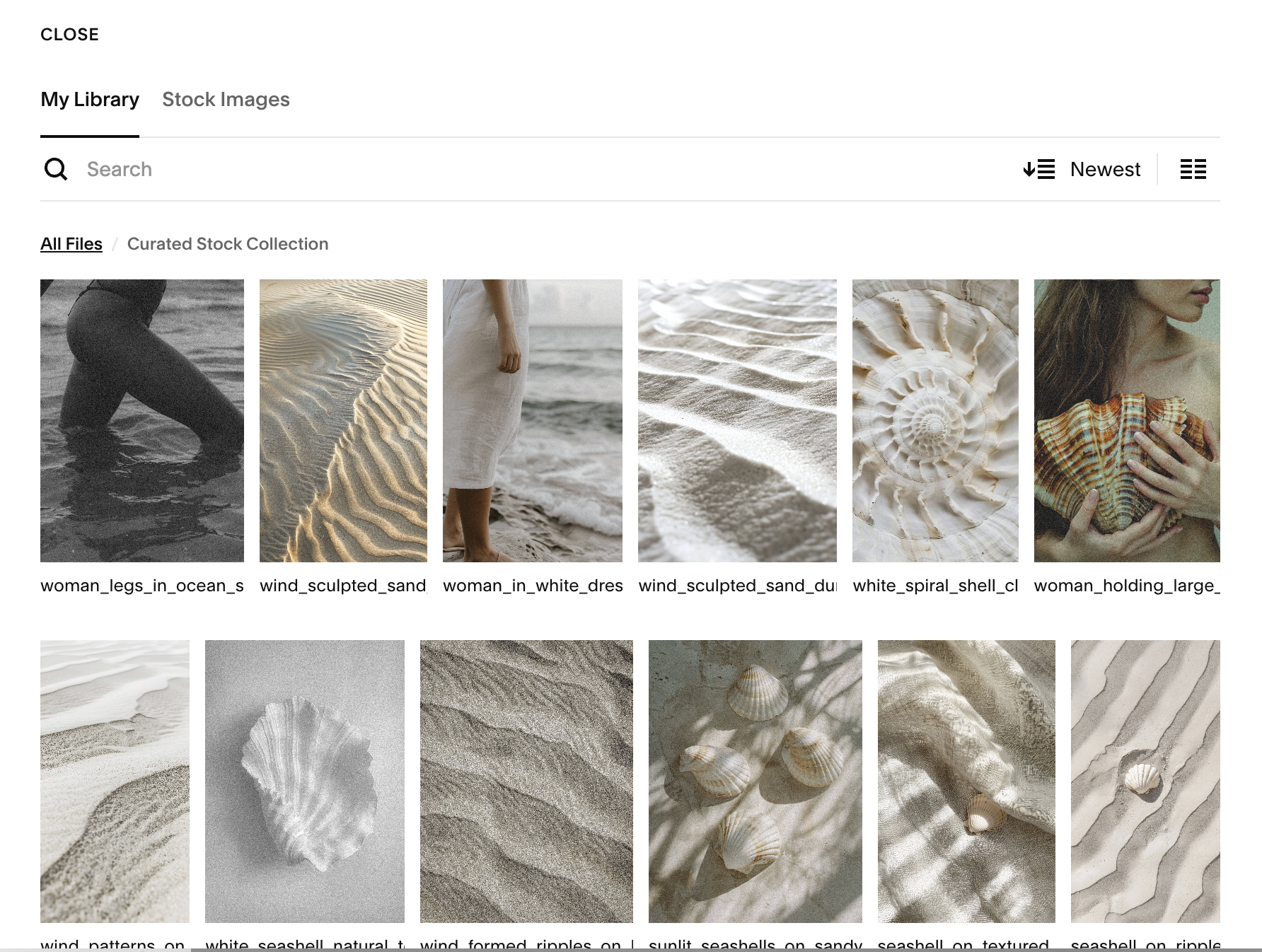
CURATED ON-BRAND STOCK IMAGERY
ASSET COLLECTION
50+ on-brand images intentionally selected already uploaded into website backend for marketing material use
Brand Goals
BRAND VALUESTruth • Sovereignty • Reverence • Wholeness • Integrity
BRAND PURPOSE & VISIONTo revolutionize women's care globally through education, remembrance, embodied leadership, and womb-centred support.
A future where women trust their bodies.
A future where womanhood is honoured.
A future where home birth, cycle literacy, womb wisdom, and feminine sovereignty become cultural norms.
MISSIONTo guide women through the initiations of womanhood with reverence, truth, education, and unwavering support.
BRAND PROMISETo restore women's relationship with their bodies, wombs, cycles, fertility, grief, sensuality, and feminine wisdom.
When you enter Sydney’s world, you will feel held, witnessed and a return to yourself where all parts are welcome, felt and integrated.
DIFFERENTIATORS FROM OTHER PRACTITIONERSShe has lived it — not learned it second-hand. She doesn't bypass grief. She honours it.
She combines education and embodiment.. physiology and mystery.
She believes women are whole, not broken or in need of fixing.
She is building a movement — not simply offering sessions or mentorship.
TARGET AUDIENCEWOMEN. Who:
Are navigating fertility journeys
Experience painful cycles
Feel disconnected from their bodies
Have experienced miscarriage or early loss
Crave deeper understanding of feminine physiology
Want both emotional support and practical knowledge
Feel exhausted by clinical approaches alone
Long to feel at home within themselves
WEBSITE MAIN GOALPrimary Conversion:
Apply for 1:1 Devotional Womb Mentorship
Everything else supports this — all call to actions, resources/freebies, invitations lead toward mentorship.
TECH STACKSquarespace Website (including intake forms)
Squarespace Scheduling — client booking system, calendar + availability management, email reminders
Stripe — payment processor connected to Squarespace Scheduling for all bookings (or deposits)
Colour Palette
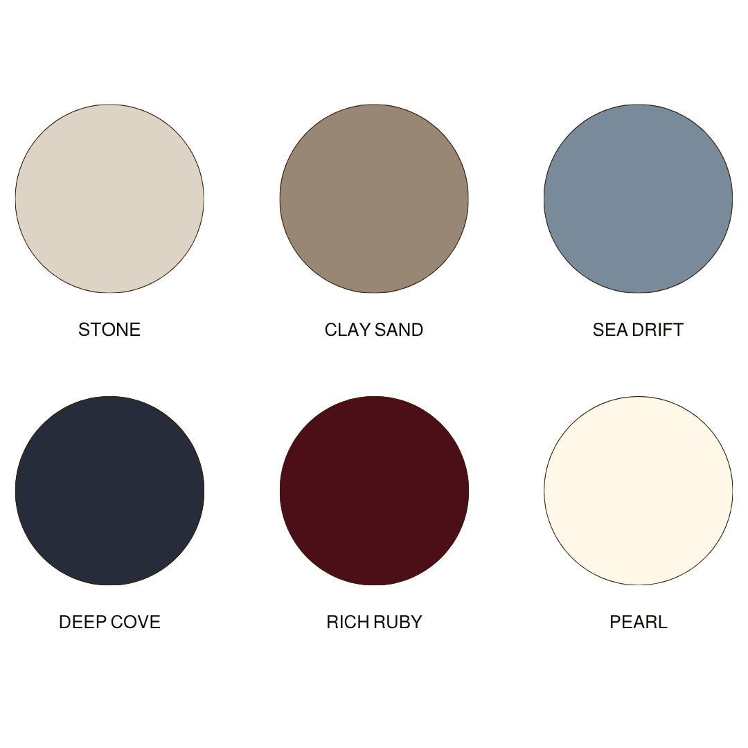
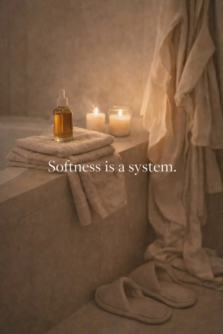
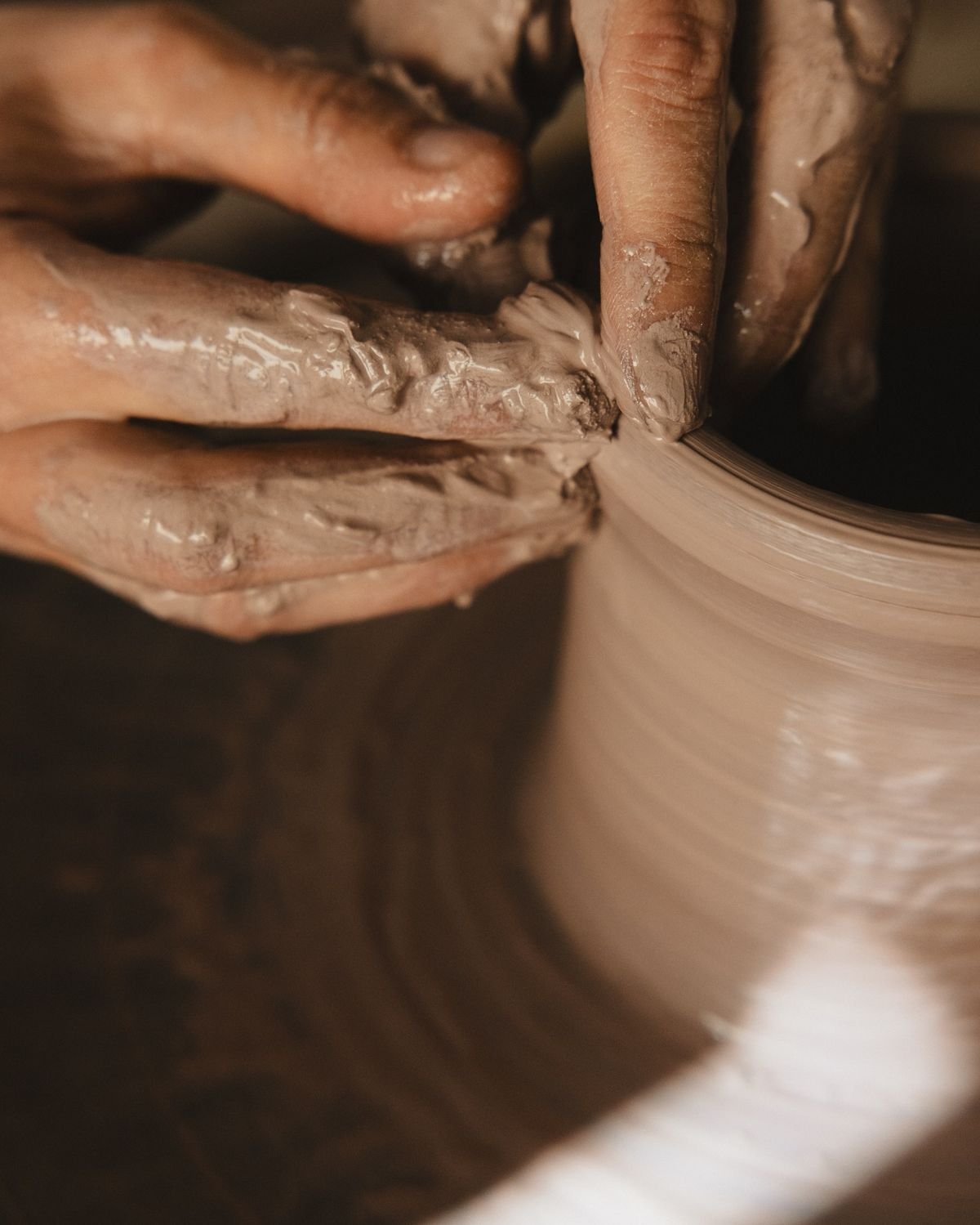
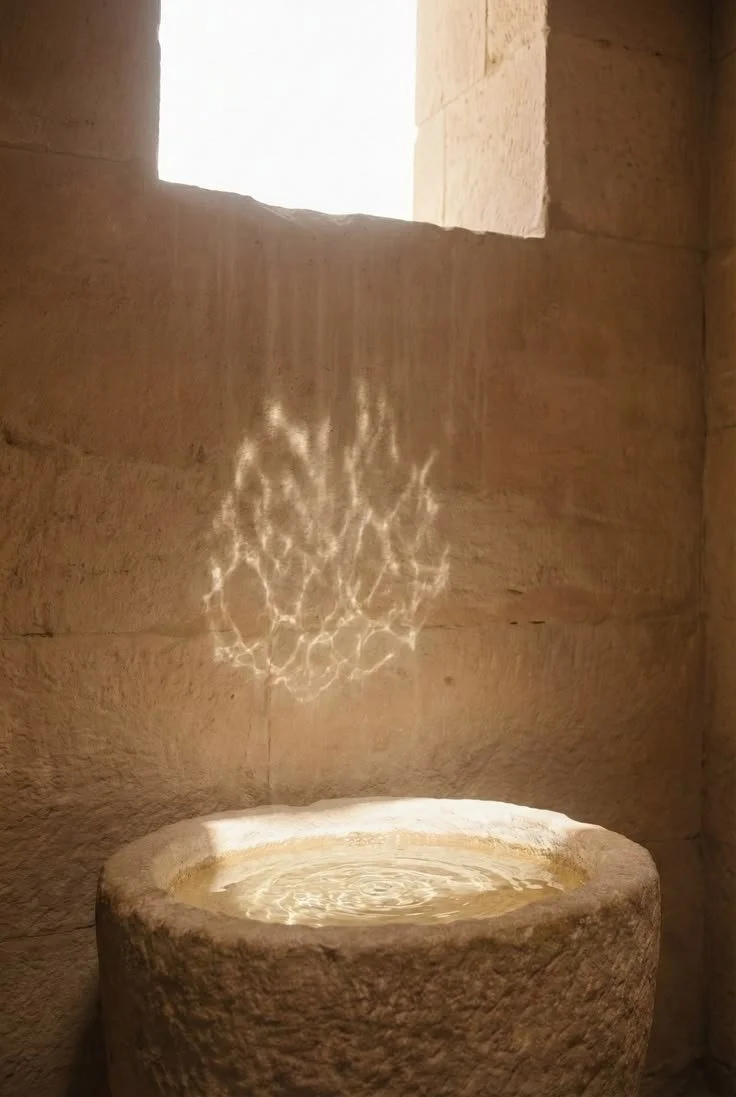
a colour palette that feels likesalt water drying on sun-kissed skin, honey-warmth and ripeness, pomegranate juice dripping down arms, rose petals pressed between scripture, quiet breeze shimmying linen curtains in a coastal sanctuary, stillness before a storm, sacred light spilling into an ancient temple.


Colour Psychology & Associations ↘
Sydney's colour palette reflects the essence of her work: ancient remembrance of the natural elements we originate from, bone-deep wisdom carried through lineage and the simplicity of arrival, not by adding anything more to crowd or overwhelm but to remove anything not rooted in truth.
Inspired by ocean tides, weathered stone, fertile earth, and the deep red heart of the rose, these colours create a visual language that both ground and stir mystery.
Together, the palette balances the nurturing qualities of the light feminine with the potency of ocean-depth, the mystery beyond what even science proves but a womans body holds in gnosis.
Stone provides spaciousness, softness, and calm. Inspired by sun-bleached limestone, ancient temples, and weathered cliffs meeting the sea, it creates an immediate sense of safety and exhale. Psychologically, Stone encourages reflection, stillness, and trust, offering women a place to land amidst the noise and overwhelm of modern life.
Clay Sand introduces warmth, humanity, and connection to the earth. Nodding to coastal landscapes shaped by time, and the way we mould clay to create a new shape this colour grounds the brand in the physical body and the wisdom of nature.
Sea Drift brings fluidity, intuition, and emotional depth. Inspired by ocean mist and weather-worn waters, it reflects the feminine principle of flow, adaptability, and feeling. Traditionally associated with calm, contemplation, and trust, Sea Drift mirrors Sydney's work of helping women reconnect to their inner waters, emotions, and intuitive knowing.
Deep Cove anchors the palette in mystery, wisdom, and quiet authority. Like the deepest parts of the ocean, it represents the unseen currents beneath the surface — the places where truth, grief, instinct reside. Deep Cove communicates depth, credibility, and reverence, traditionally used in marketing for its association with reliability, professionalism, security and loyalty.
Rich Ruby is the beating heart of the palette. Symbolic of blood, vitality, sensuality, devotion, and power, it honours the sacredness of womanhood and the womb itself. Rich Ruby evokes passion, courage, life force, and speaks to the vigor that lives in our base — our sacred rage, enthusiasm and sex. It reminds us that all energy belongs and is part of the creative process.
Pearl introduces light, purity, and innocence. Soft and luminous, it is associated with wisdom gained through experience, time and tension — like Pearls themselves are made. Acting as a blank canvas for those who walk with this brand to recreate themselves by shedding the old, this creme white breathes openness and expansiveness within the palette.
Brand Astrology
-
Rising Sign
Physical body
Appearance + style
Personality + character
Truth illumination
What people notice about you
The “face” you put on
Your motivation for living life
Outward emanation
Your rising sign broadcasts your medicine for you quite naturally. It is likely what people have reflected back to you as qualities they receive from being around you. This is the role you came to play.
ARIES RISING: Courage. Warrior. Action Oriented. Passion. Divine Masculine. Fire. Bold.
-
Ambition. Legacy. Progress. Boss/CEO energy. Building. Purpose. Discipline. Resilience. Endurance. Empire. Success.
-
Revolutionary. Visionary. Black sheep. Eccentric. Innovative. Inventive. Genius. Cosmic. Quantum.
Mercury CODES
YOUR COMMUNICATION PLACEMENT
Ruler of communication
Articulation
How you share yourself
Speaking
Copywriting
Mindset + perception
Learning style
The Mercury placement gives us valuable information about how you are already wired to express and communicate, and the most align way to share your unique message. These are your gifts of communication and articulation, so that your dream clients can really receive you.
Leverage this code in your content creation for your aligned audience to resonate with you and disrupt any outdated paradigm marketing + sales tactics that don't feel good for you.
Venus AESTHETIC
YOUR MAGNETISM PLACEMENT
Where you’re charmed or lucky
Most ease in manifesting
How you connect with others
Attraction + desire
Beauty + aesthetic
Ease in sales
Receptivity
Your Venus reveals where and how you are most magnetic, and your most exalted state of attraction. This speaks to the environments and energies that align you to your receptive mode and what people love to pay you for.
Working with your Venus brand code increases magnetism, so it is what we focus on most for visual identity, aesthetic and "vibe" to exude.
Brand Tone & Voice
Mercury in Capricorn gives:
Authority without arrogance
Clear, grounded leadership
Thoughtful and deliberate communication
The ability to turn wisdom into practical guidance
Strong educational content rooted in experience
Credibility and trustworthiness
Long-term thinking and strategic vision
A natural teacher's voice
Venus in Aquarius gives:
Community-centred leadership
Revolutionary thinking
Future-focused vision
Authenticity over performance
A desire to create meaningful cultural change
Deep respect for individual sovereignty
Inclusive and expansive perspectives
The ability to build movements, not just audiences
Tone Words
Reverent
Truthful
Sensual
Grounded
Powerful
Mysterious
Devotional
Uncompromising
Wise
Embodied